I have always prided myself on being a multi-disciplinary designer; print whilst being less and less common nowadays due to an ever growing digital world as well as printing costs doesn’t mean I don’t know how to artwork and design for print alongside my digital background.
And presentations, well they’re always going to be part of the bread and butter of a designers repertoire; whether outputting sales pitch documents, creating interactive PDFs (iPDFS) or designing up templates for other members of the business to use. I’m used to creating presentations in a variety of formats.
The Challenge
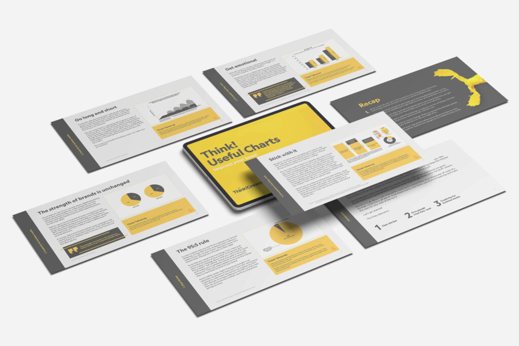
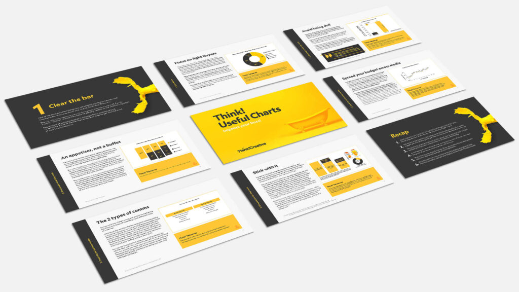
To create a presentation deck full of useful charts and information that we could use as a sales tool to send to prospective clients. Working closely with the Creative Strategist who provided sourced graphs and content. I came up with a graphical style, recreated those graphs in that and came up with a look and feel.
My Thinking
Due to it being a sales tool, the information needed to be easily and quickly digestible with the intended target audience being Marketing Managers; people who are often short on time and need those states to wow their boss. Hence the ‘takeaway’ box.
The Solution
A clean cohesive style on all the charts whilst sourced from multiple places all have the same look and feel. Content in small digestible chink with a ‘key takeaway’ for each page if skimmed. Graphs and quotes easy to pull out should people require for their own presentation decks.
The Outcome
A 20 page PDF separated into 3 sections depending on the information that was being given, less than 300kb in size so easily attachable to email with information that the target audience would be interested in.
I like the way these pages are looking and how the content is working… clean informative and direct.
Paul Hough, CD @ Think! Creative
