Branding is important.
HerdVision are a start-up company and aside from the name, there was no brand identity to give them a professional feel.
The Challenge
To create a visual identity, brand and brand guidelines that could be applied to all places it needed to be.
My Thinking
Cows.
The software that HerdVision uses is new, it is unheard of, and I believed a style was needed to highlight the core focus of the product; cows, so even if you didn’t know what it was you could make a strong guess just by seeing the logo. The industry the product was being used in was for both farmers, but also investors.
Frankly the farmers weren’t bothered by the styling (they admitted as much in the group research), they just wanted to focus on the nitty gritty details of the software itself, however with the team doing many trade shows and networking events; it was important to have a bright brand which stood out; and from feedback, this did.
The Solution
The solution
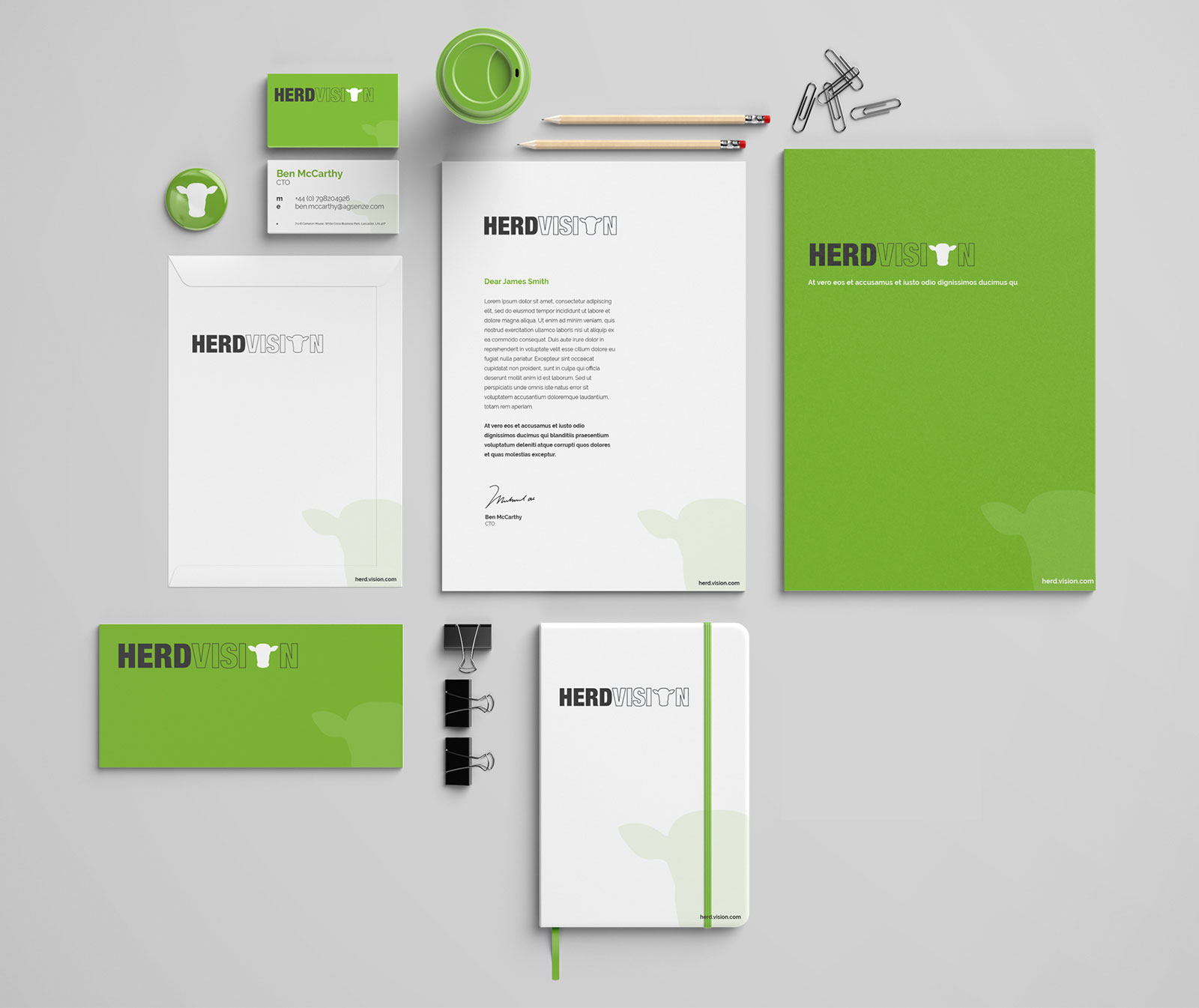
A clean modern identity where the application could easily be applied to a variety of assets whether that being social or further down the line OOH and print advertising. With them all having a consistent feel, the use of the cow icon from the logo could and is applied as subtle watermark.
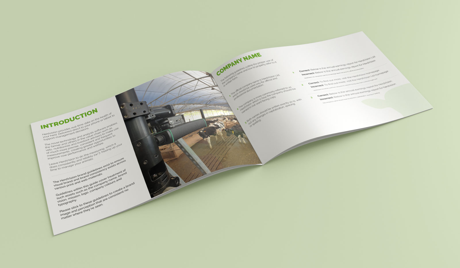
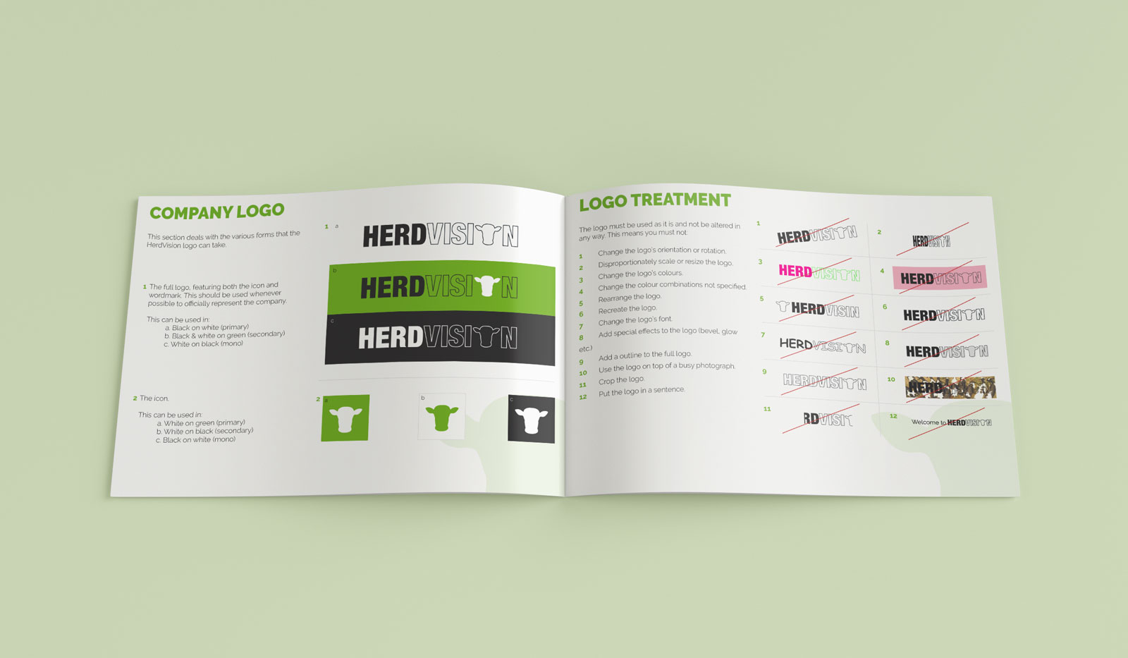
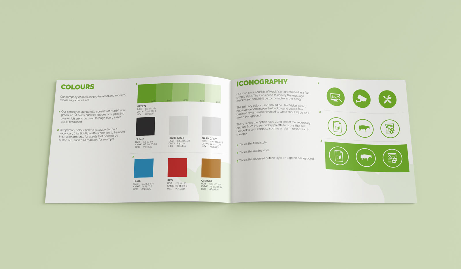
As the company was a start-up, obviously there was not brand guidelines so some basic ones were created mainly so the team of developers had a visual reference of what they can and can’t do with the logo. I felt this was important especially as the company was starting out; I wanted to ensure everything that went out was all consistent.
The Outcome
A modern brand identity, with a set of brand guidelines and stationary application to ensure HerdVision was seen as professional, despite their age.
Feedback was hugely positive from the events the team went to, the brand was liked for bringing a playful aspect to a rather dry industry.

